


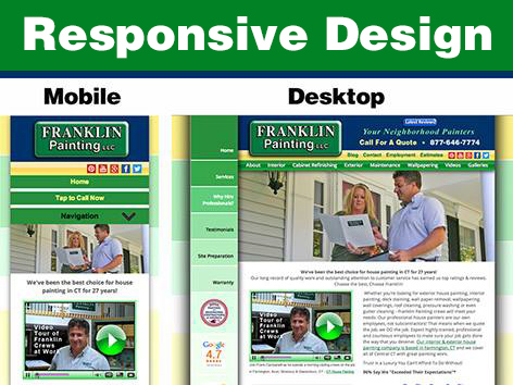
Franklin Painting LLC, Farmington CT- Responsive Web Design by Brandtastic
With over 7 billion mobile devices in the world, having a website that is optimized for mobile devices is no longer a question of “should” but “how.” Most companies know that having a mobile friendly site is imperative to reaching their target audience that spends most of their time on-the-go, but many companies are confused as to whether they should choose a dedicated mobile site or a Responsive Web Design.
What’s the Difference?
Mobile Website- A mobile website is a separate website designed entirely for mobile devices like smartphones and tablets. A mobile website is a simple & ergonomic design that allows users to quickly and easily navigate the basic aspects of your website on their small devices. When designing a separate mobile website, company should keep in mind the smaller screen size, touch screen interaction, and slower connection speed. In most cases, the URL for a dedicated mobile website would be m.companywebsite.com.
Responsive Web Design- Responsive Web Design is a single website that automatically adjusts to fit the screen size of the desktop, laptop, or mobile device on which it is being viewed. Platforms like WordPress (our favorite) allow web designers to adapt the written content, navigation, visual design and method of interaction so that your company website looks amazing no matter what computer or device it is being viewed on.
So Which is Better?
Although both of these types of mobile-friendly sites can optimize your content for mobile devices, dedicated Mobile Websites are becoming outdated for a number of good reasons. Because having a dedicated mobile website means needed multiple URLs, your customer has to remember at least 2 URLs, or wait to be redirected to the mobile website (which can take several seconds) if they visit the primary web address first.
Not to mention, you will need to pay for and maintain two separate websites. This can be costly and time consuming, especially if you do not have the expertise to design and implement an effective website. Also, two separate sites means you will need to take double duty on SEO & marketing methods. If you want both your dedicated mobile site and your regular company website to rank well, each website will need separate SEO work in order to compete.
Another important fact to remember is that not all mobile devices are universally compatible. Some mobile devices provide a touchscreen interface whereas a few still require keyboard navigation. Because of the different types of capabilities, one single mobile website won’t look or function the same way across all types of devices.
Responsive Web Design, on the other hand, is a great combination of usability and convenience. Because RWD only requires one website, it is easier to update content, administer changes, and quickly refresh the look and feel of your site. This also makes sure users can easily find you on their mobile devices without having to wait for redirects. These few seconds saved can determine whether or not a potential customer will bounce from your site before it loads or stay to play. A single, responsive website also means that less time can be spent on SEO and creating specific content strictly for mobile devices. And as we all know, time equals money.
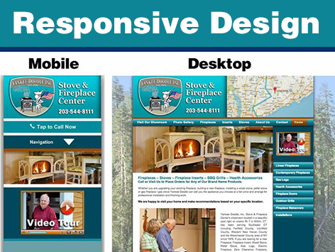
Yankee Doodle Inc, Wilton CT – Responsive Web Design by Brandtastic
Since site performance and load time are a factor that Google considers in SEO rankings, Responsive Web Design may provide leverage in SERPs. Also, if your website is responsive, each page will have one single URL so that it is easy to share across social media platforms. That way it won’t matter whether a user is viewing your Facebook post on their smartphone or desktop, they will go to the same webpage when clicking on a link you share.
If you are getting ready to redesign your website, it’s the perfect time to implement Responsive Web Design. Here at Brandtastic, we offer custom-coded WordPress website designs (none of those out-of-the-box template themes) that deliver a state-of-the-art, adaptable interface for users on all types of devices. Responsive Web Design is a powerful tool for most companies. If you have more questions on Dedicated Mobile Sites & RWD, give us a call so we can discuss the goals of your business and how you’d like your website to function.