


You might not think about the color scheme of your website or any website for that matter, but the colors you use are just as important as the content, layout, and ease of use. Why? Because colors make people feel things. Colors can influence how long people stay on a website; they might not notice it, but their brains do.
That’s why if you’re starting a website for your business or want to refresh your current one, getting the colors right can signal the right things to your potential customers.
Here are the most popular color schemes you’ll see and should think about incorporating into your site in 2026.
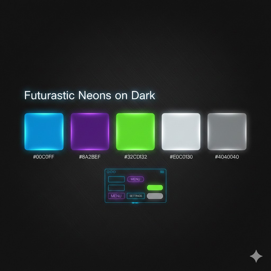 Futuristic Neons on Dark
2026 will see a strong push towards neon accents on deep, dark backgrounds. Picture things like electric blues, vivid purples, and lime greens glowing against charcoal or black.
This might seem too contrasty, but it’s trending because it is. With immersive digital experiences booming (AR/VR interfaces, gaming sites, tech brands), designers are picking these color schemes up from cyberspace aesthetics. The high contrast feels high-tech and energetic, but won’t overwhelm the user if it’s done right.
In contrast to the bold neons, many brands rely heavily on warm, earthy neutrals that convey a comforting, positive vibe. This scheme is trending because people want simplicity and calm when they’re online to combat years of overstimulation. This palette is perfect for wellness brands, eco-conscious companies, and lifestyle blogs.
Combine this color scheme with minimalist typography and generous whitespace, and you have a beautiful website that puts people at ease.
This color scheme takes traditional pastels and gives them a slightly muted, sophisticated spin. Think colors like dusty pinks, sage greens, and powder blues instead of fluorescent candy colors.
This is going to be a hot trend in 2026 because muted pastels strike a balance between softness and maturity. They feel friendly but polished, making them an excellent choice for startups, creative portfolios, education sites, and lifestyle platforms.
This isn’t the crazy contrast we saw with the neon colors on black; it’s not that flashy, but that’s the point. It focuses on crisp contrast with minimal colors: primarily black, white, and a standout accent color. This is trending because it’s ideal for professional services, SaaS platforms, and enterprise brands looking to build trust with their customers. It’s timeless, highly readable, and works well in responsive design.
2026 is also going to be a big year for vintage, making a comeback in online spaces and designs, especially retro palettes inspired by the 70s and 80s, like sunflower yellows, burnt sienna, faded teal, and dusty coral.
This is trending because retro colors emotionally connect with audiences, trigger nostalgia, and give brands a distinctive visual identity that stands out against the more modern designs. Retro color schemes feel playful but can still be made sophisticated.
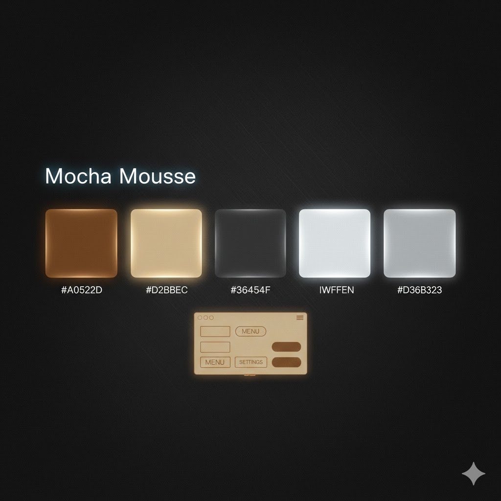 Mocha Mousse
The color of the year influences what shows up in website designs, and according to Pantone, it’s the color of the year for 2026. This color is a rich, earthy brown tone that feels classic, sophisticated, and calming without being overbearing.
This is trending because it brings a sense of calmness to a website, much like the earth tones, making the user feel grounded and assured.
If you want to give your website a makeover or need a website that will grab readers’ attention, call the marketing pros at Brandtastic. We’re a full-service marketing agency that can handle web design, Google Ads, social media, graphic design, and more! Contact us today!